Set Design
details
- Client OneLife Church
- Date 2016
- Category Logo Design & Set Signage
- Software Adobe Illustrator
creating kid city
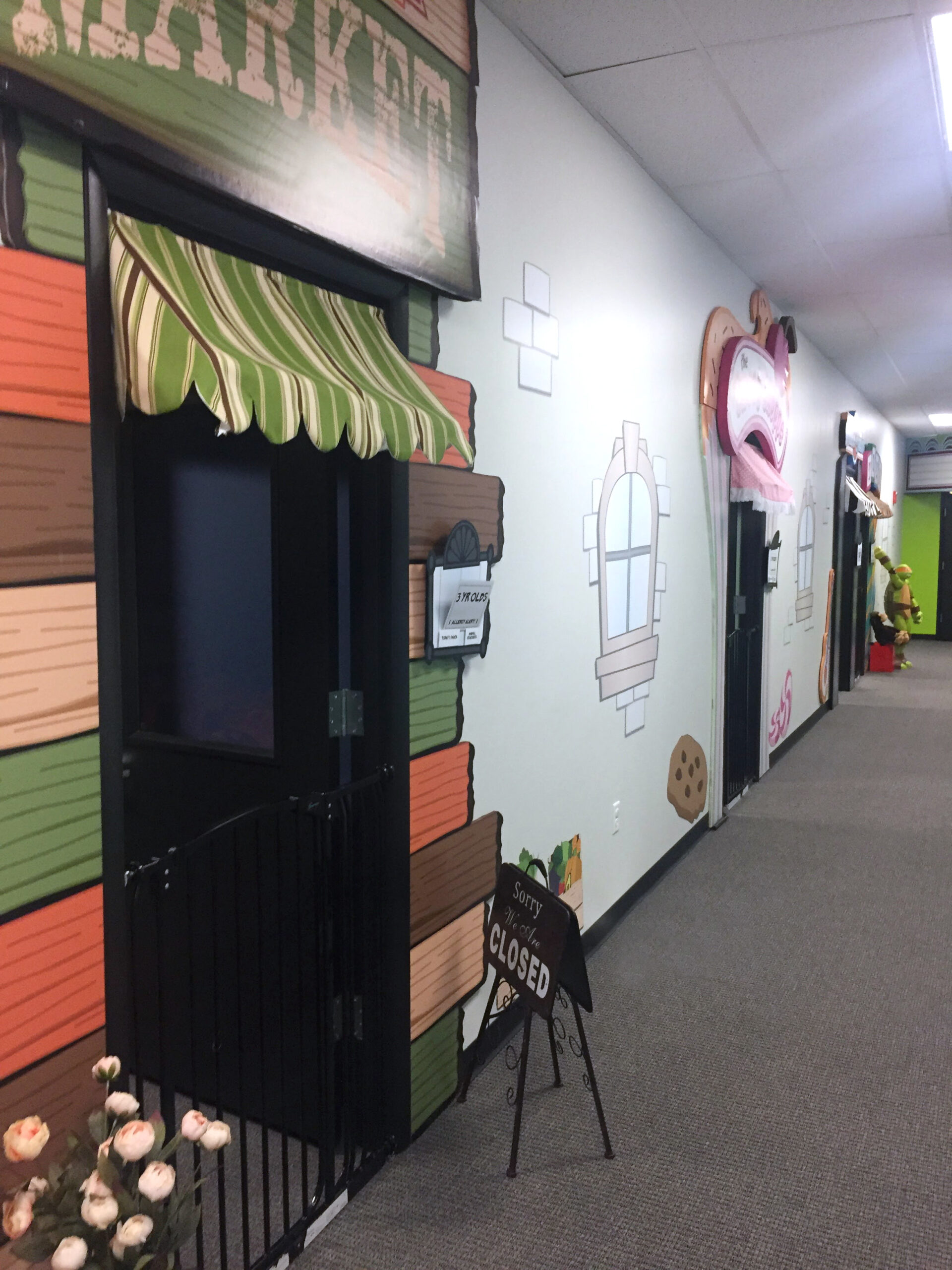
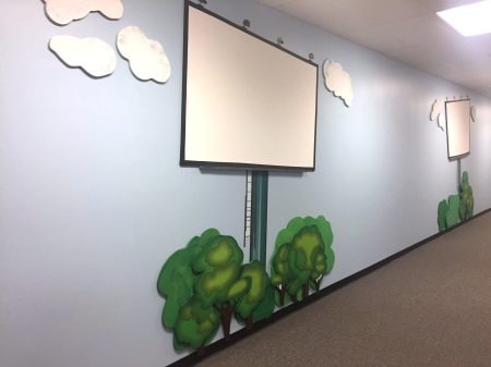
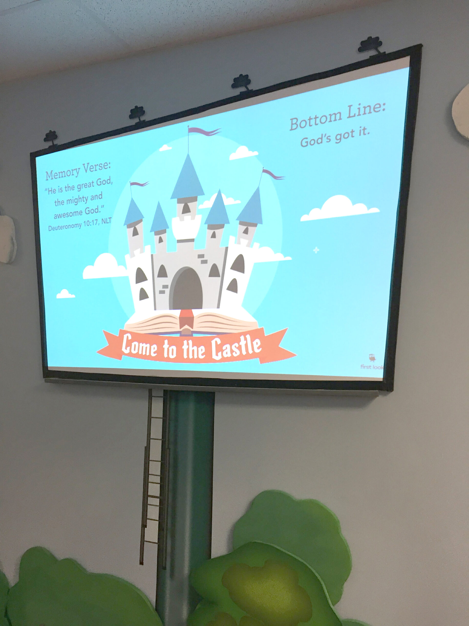
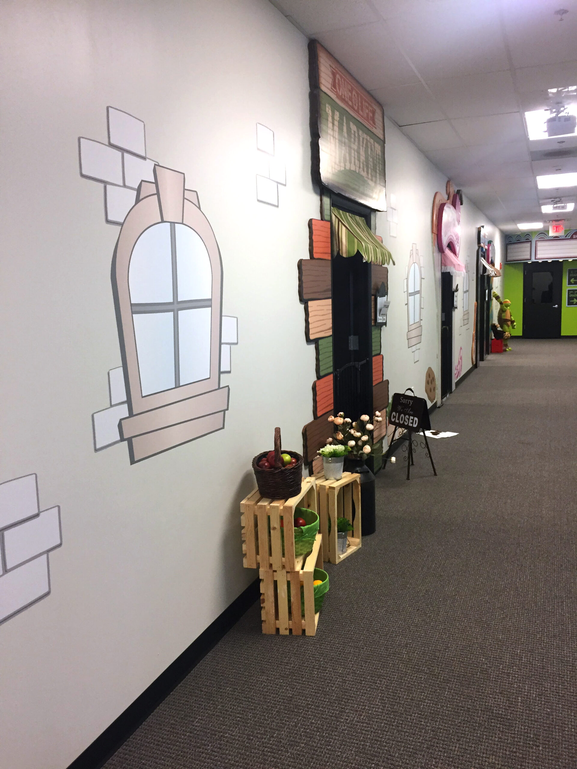
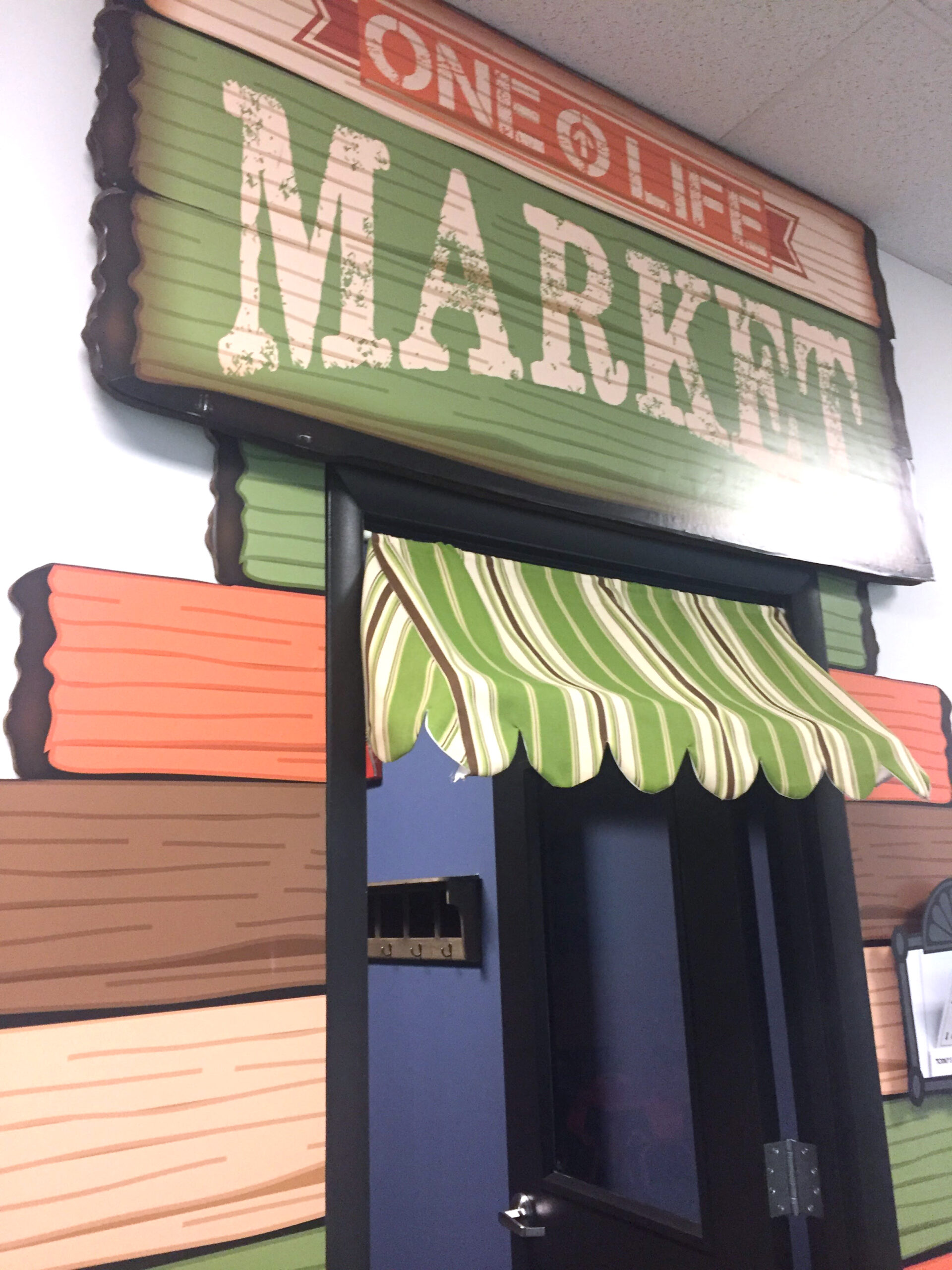
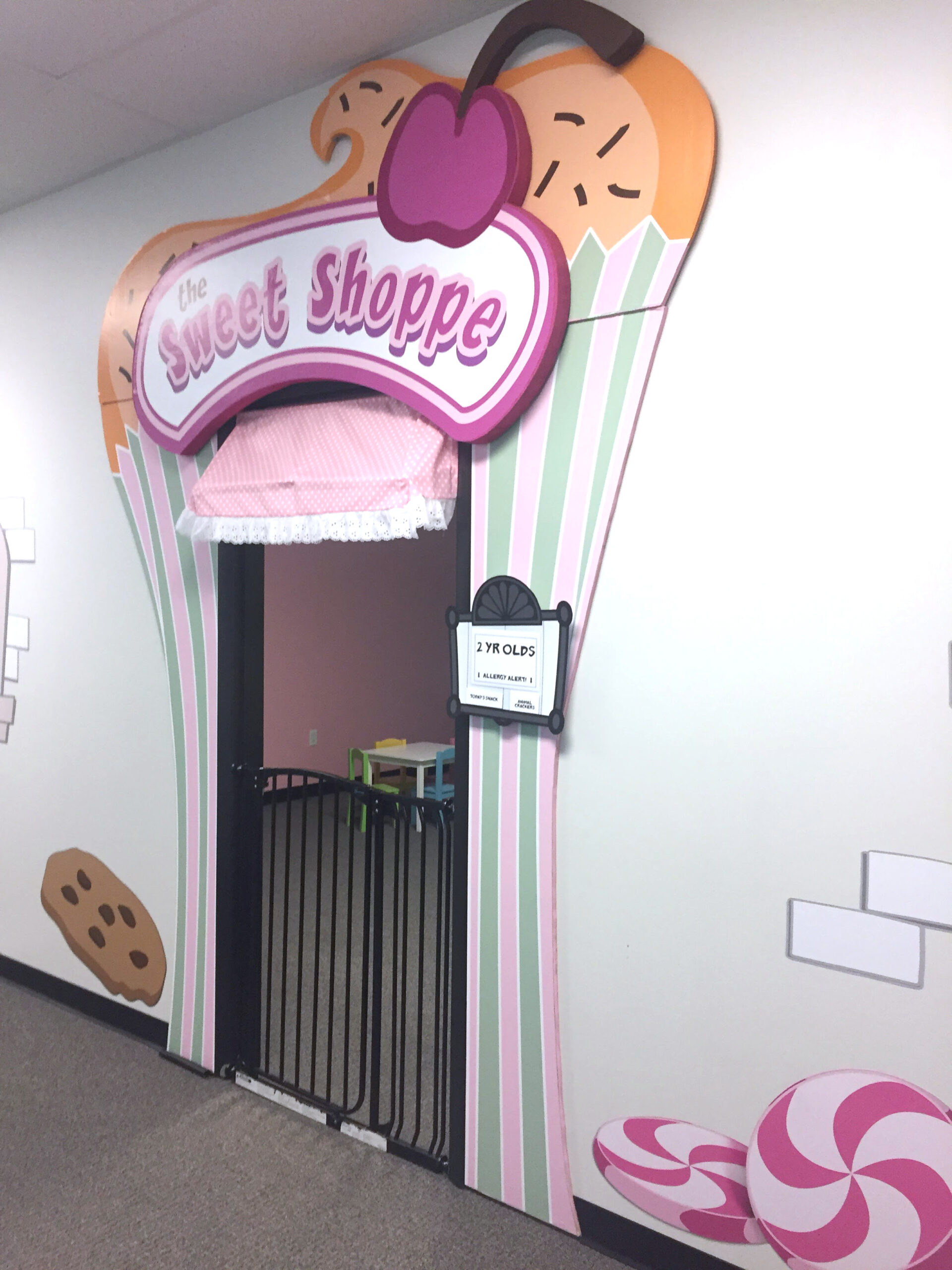
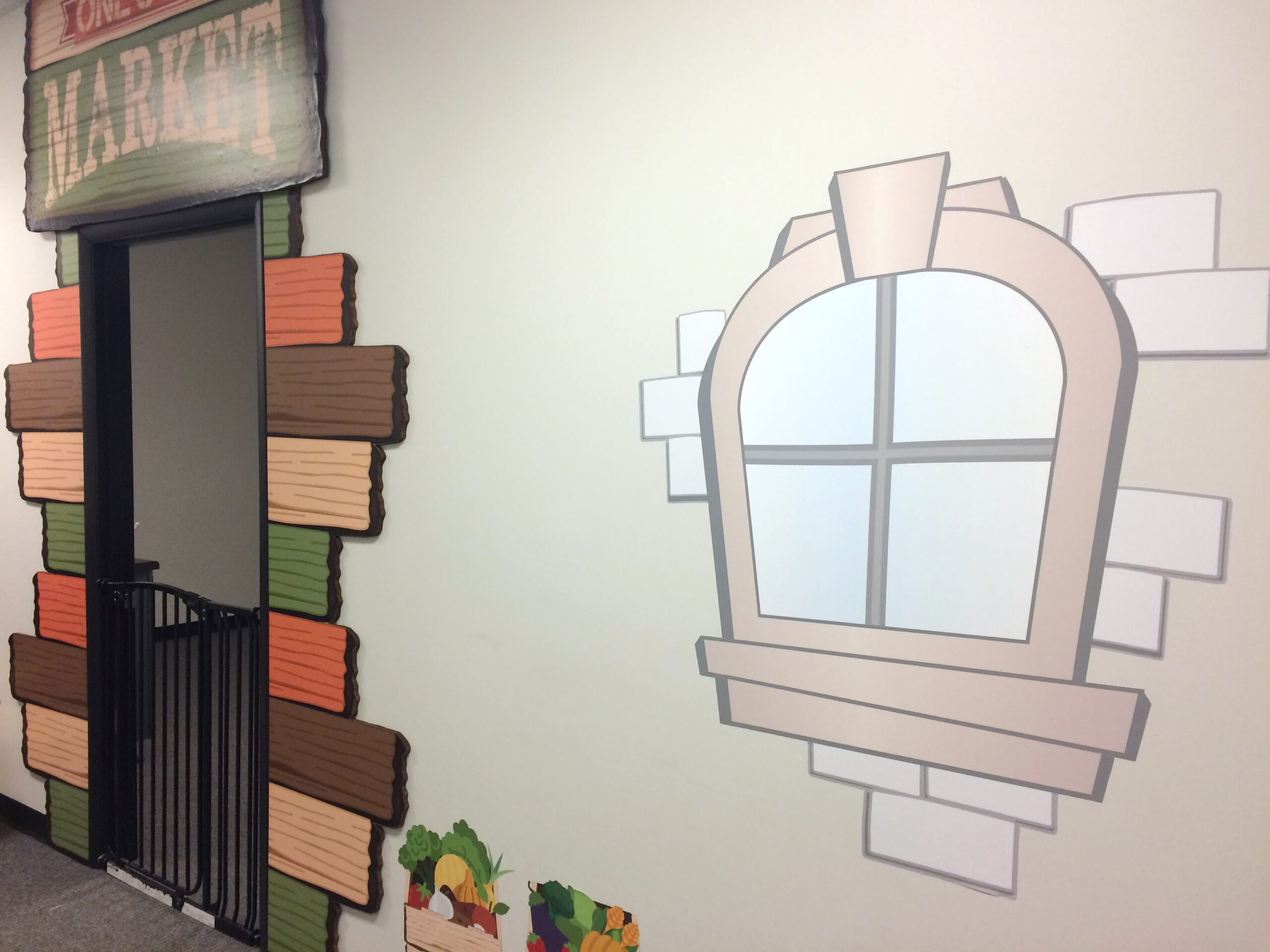
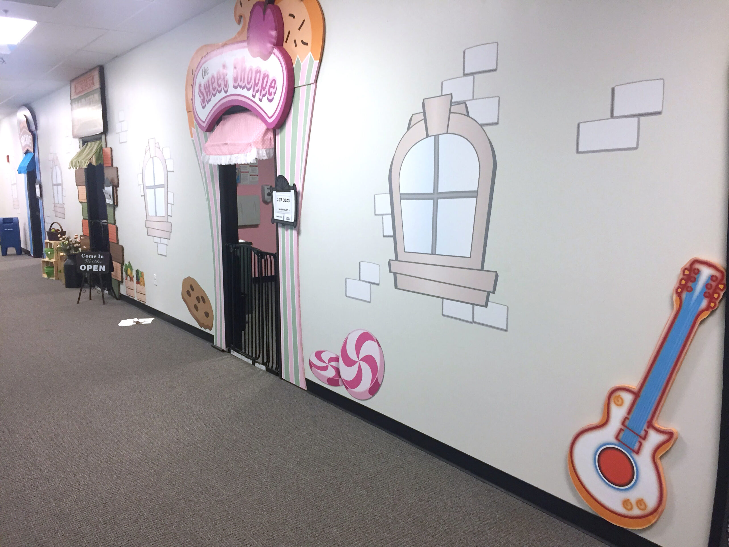
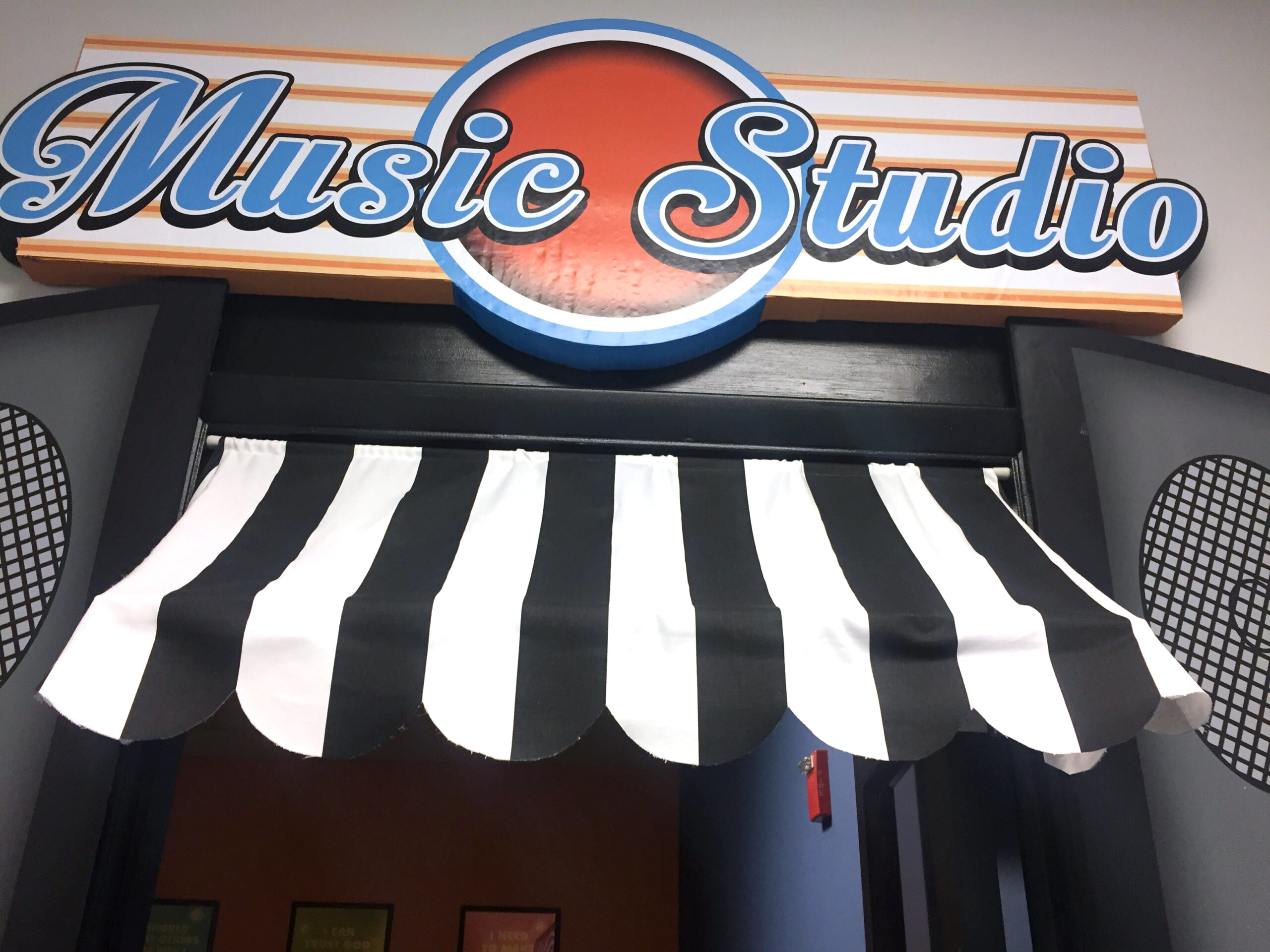
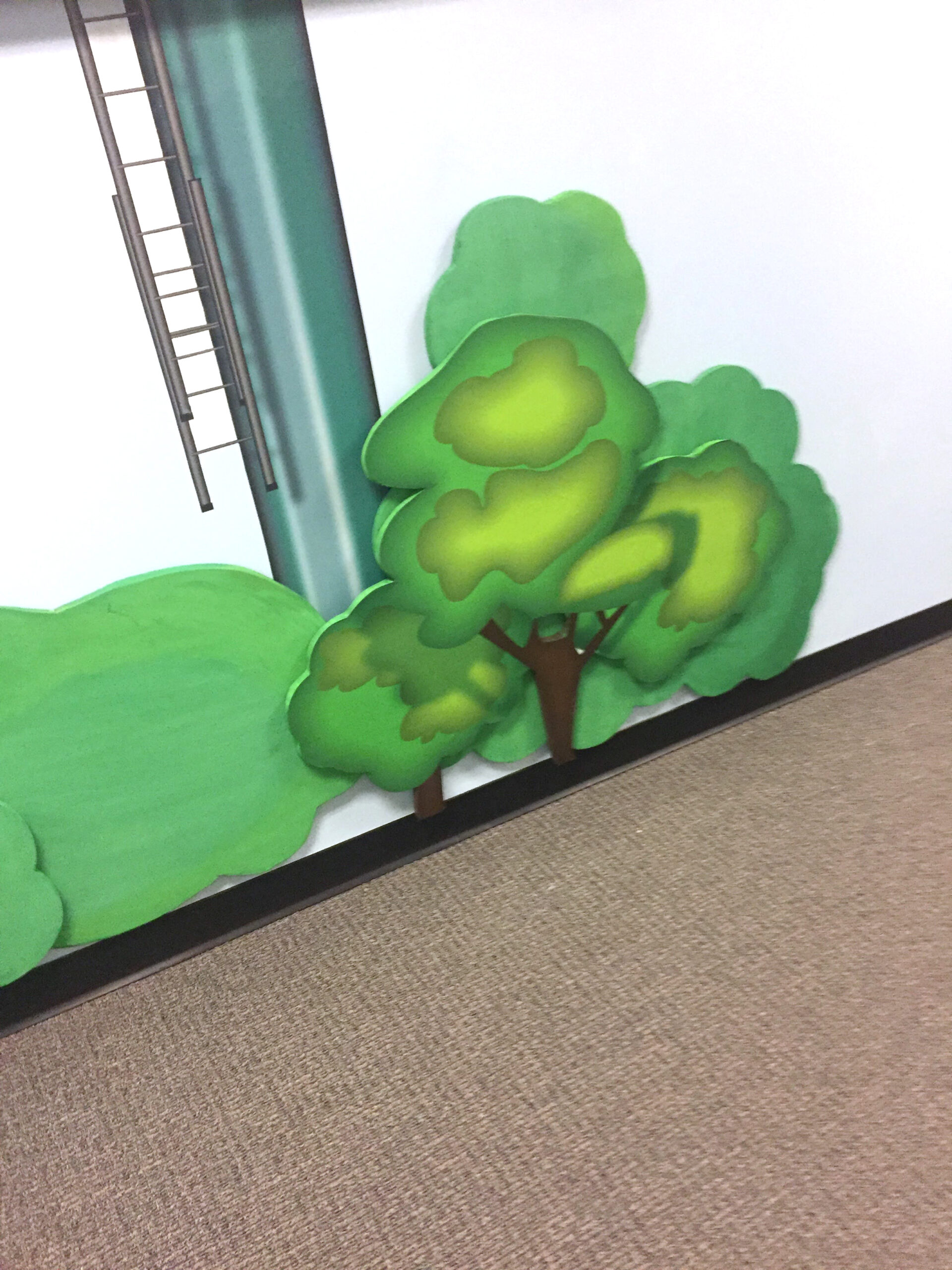
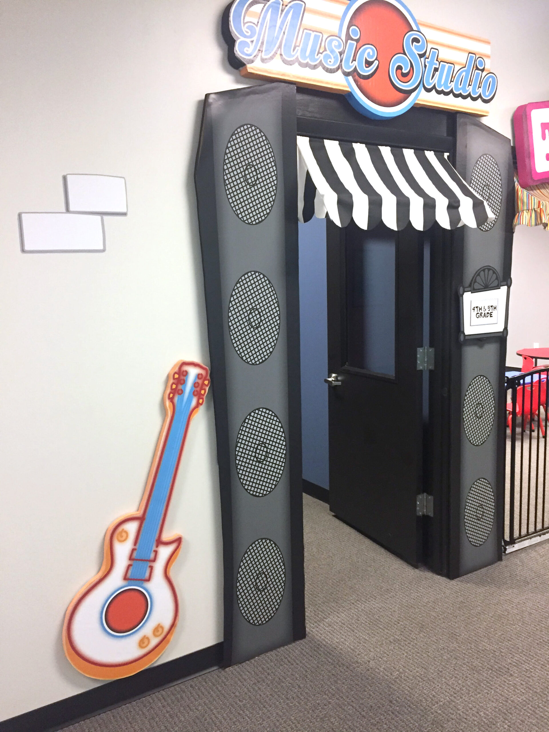
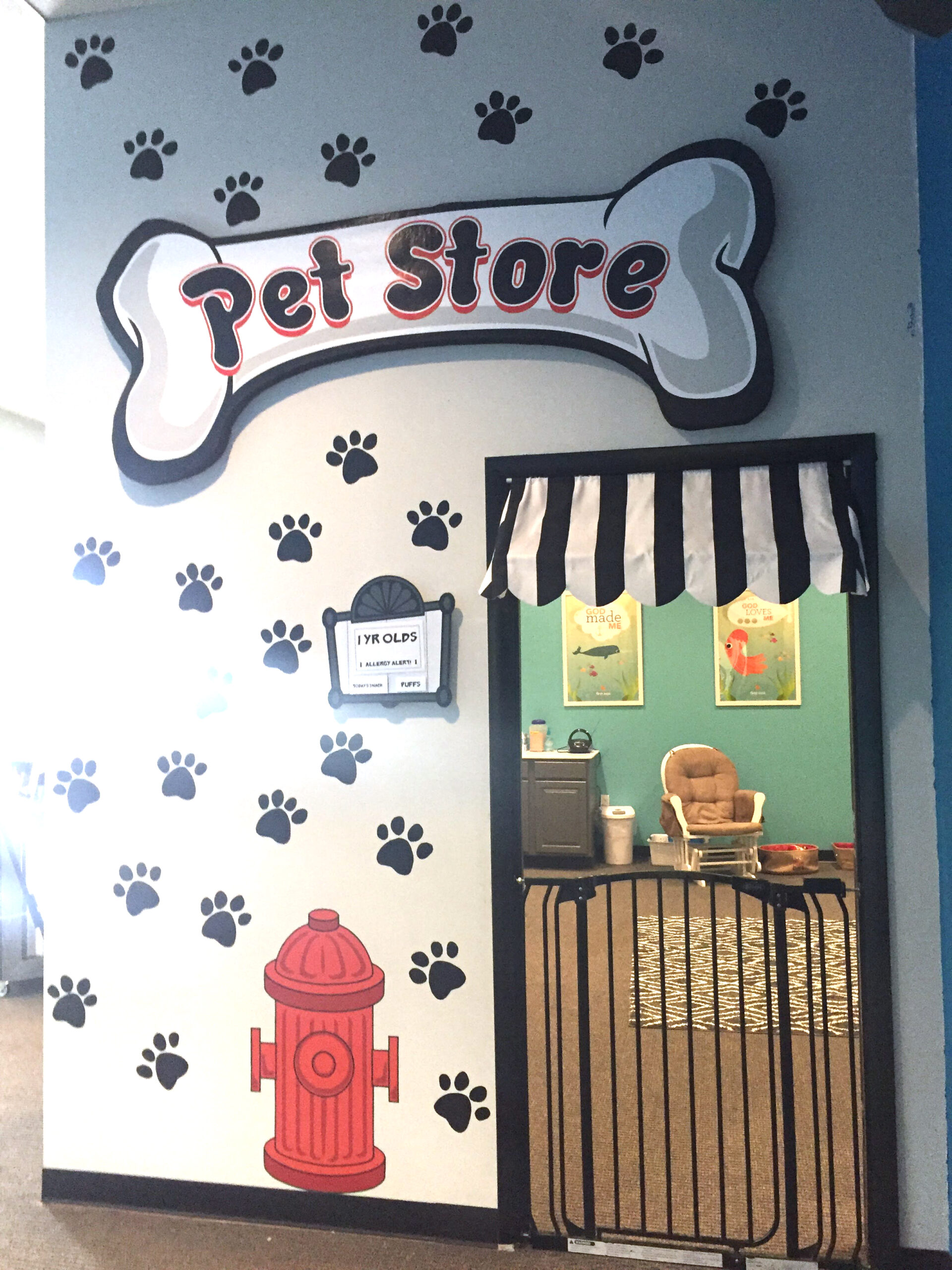
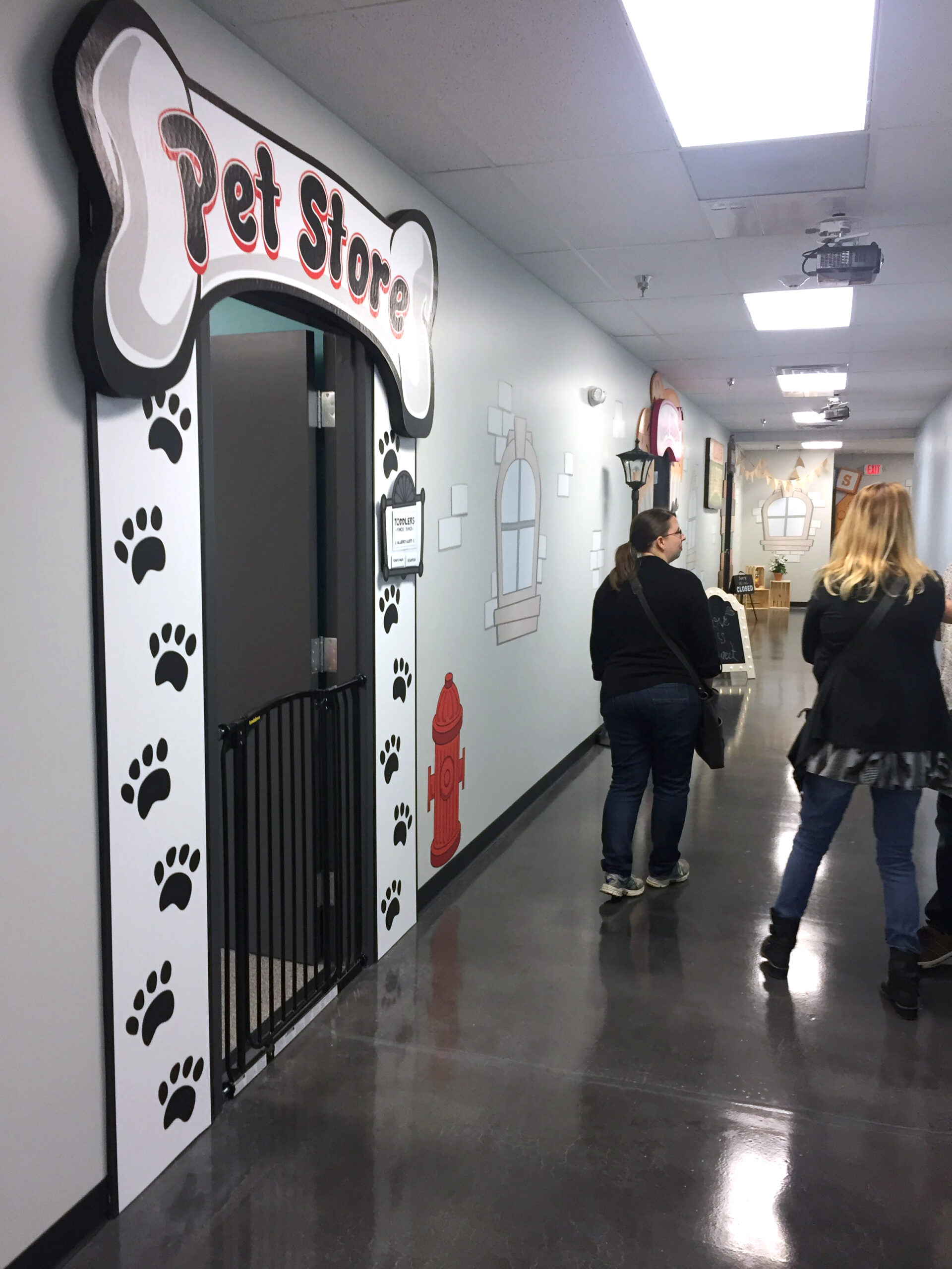
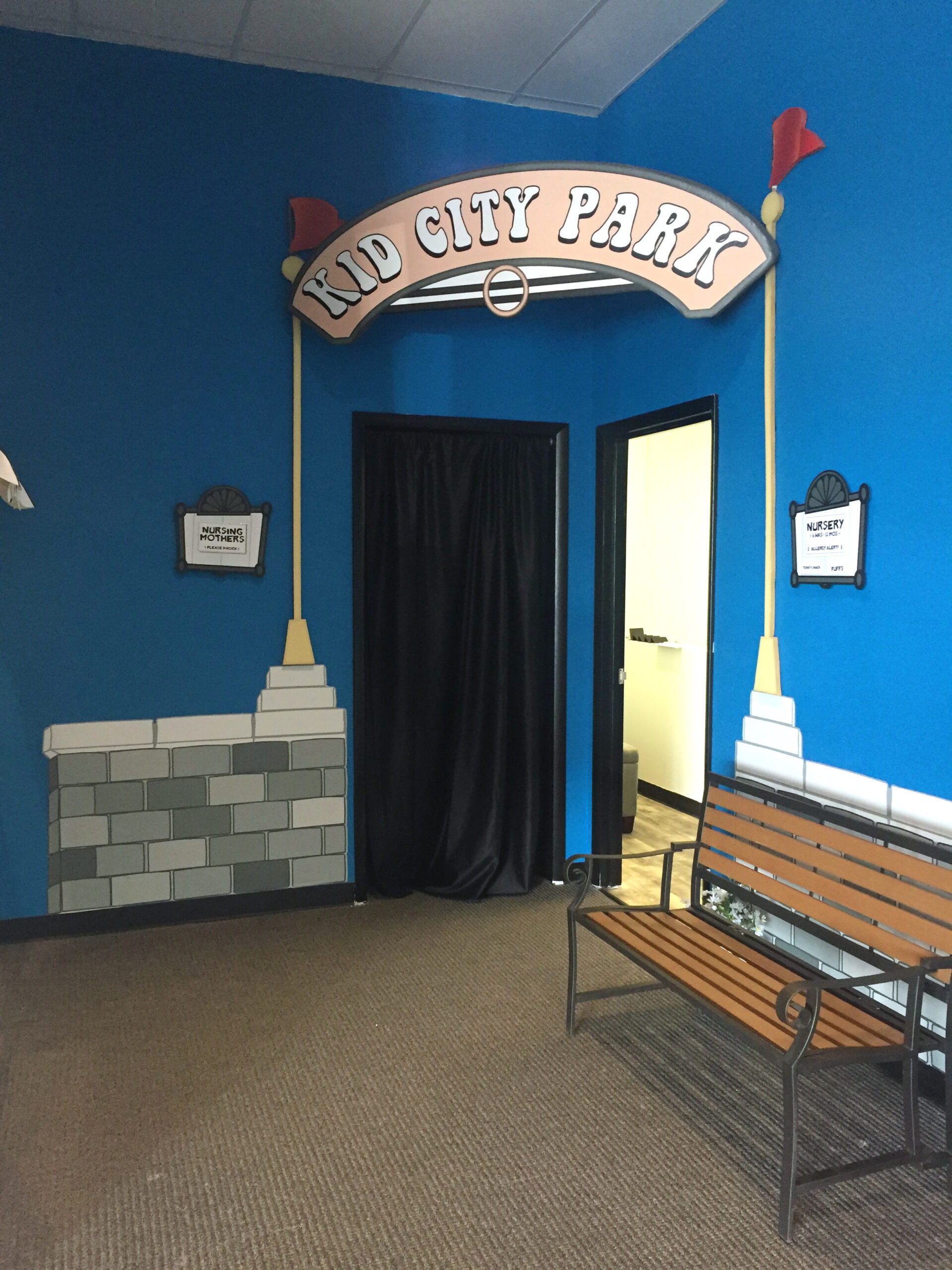
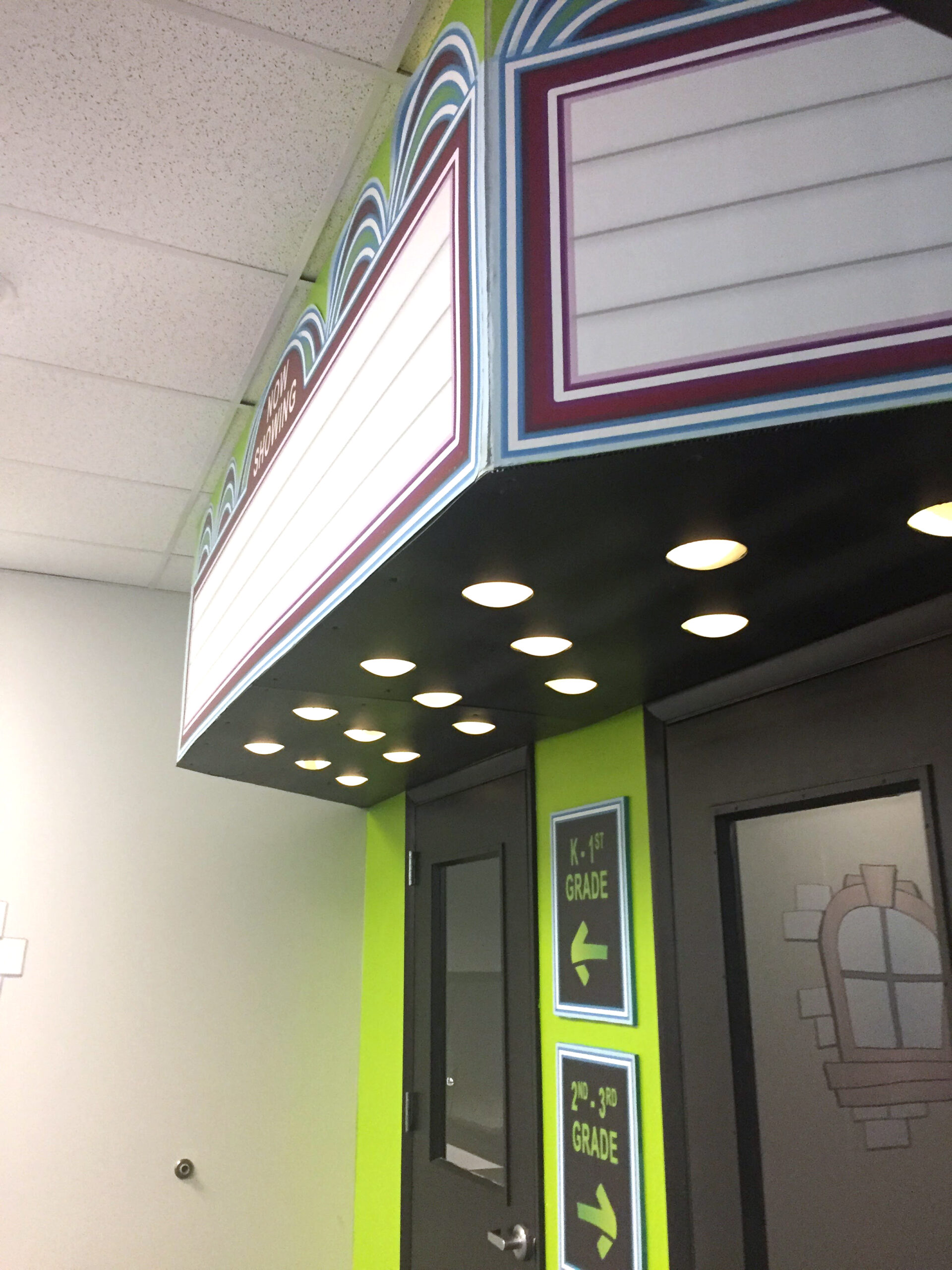
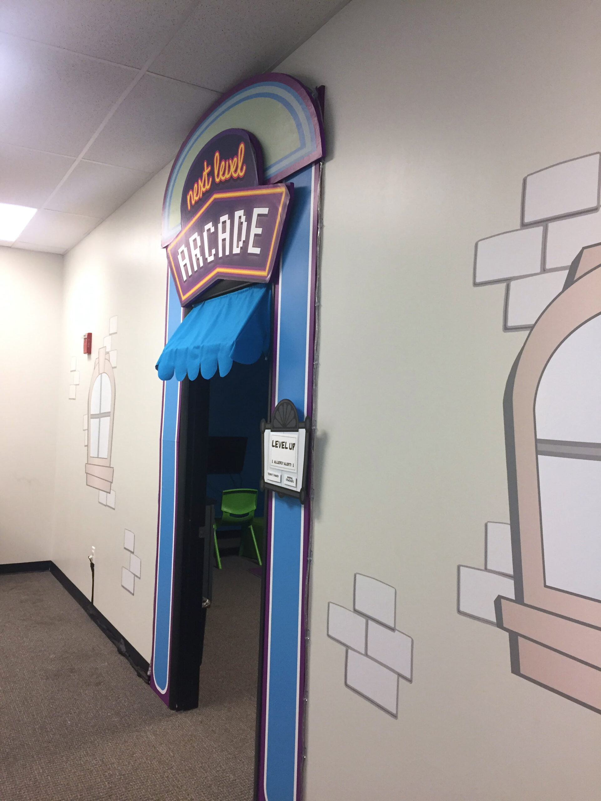
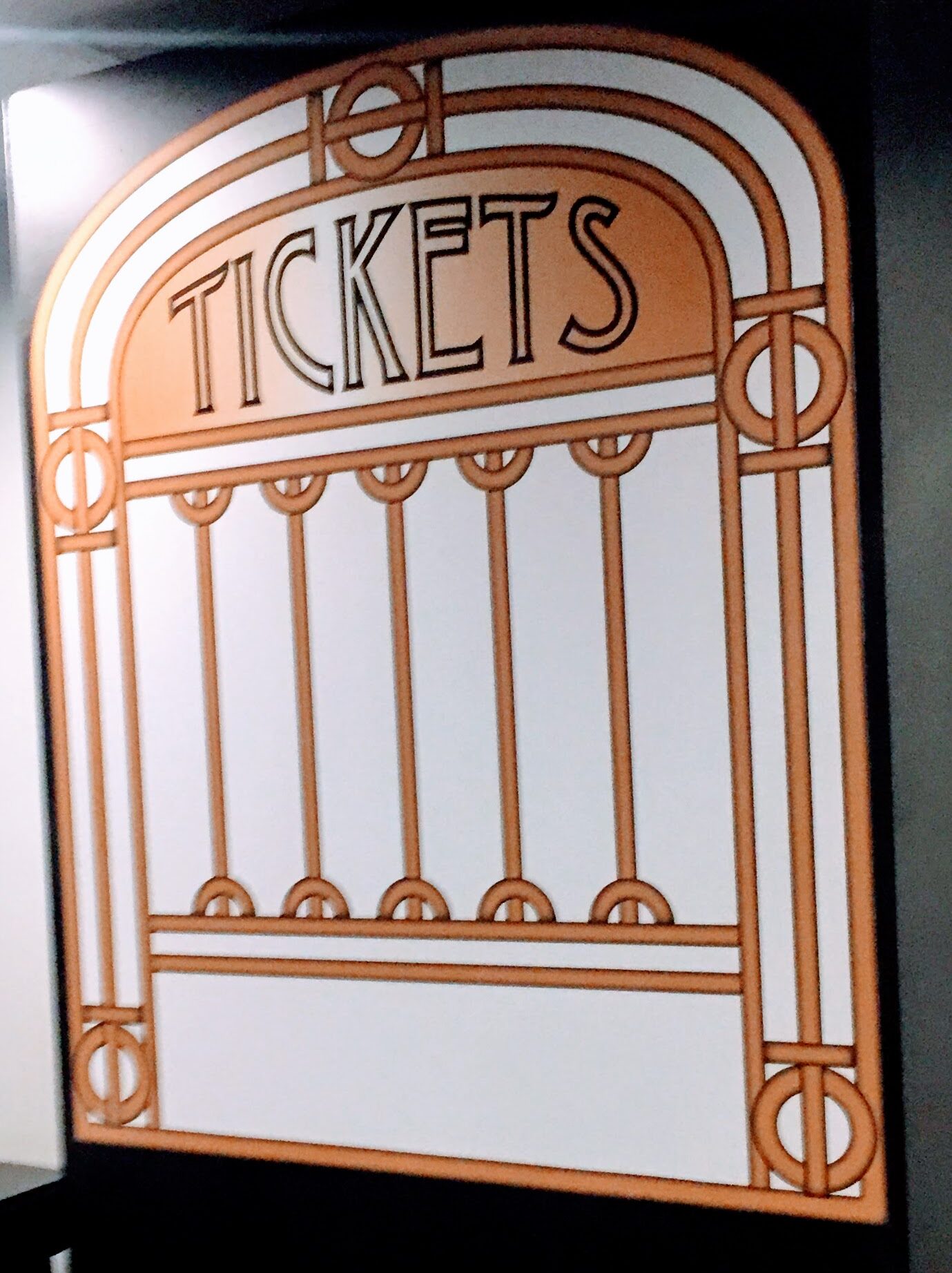
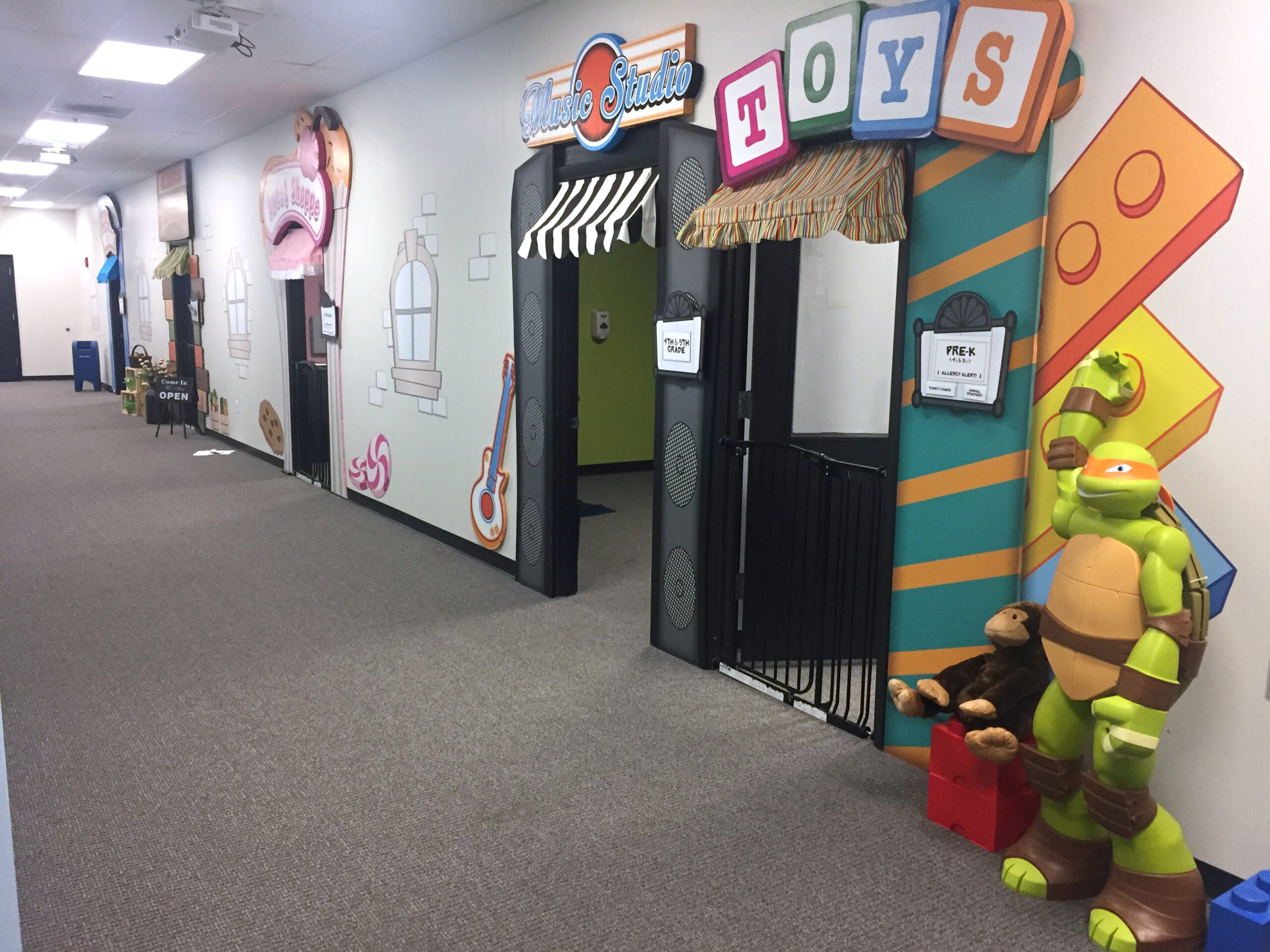
Set design for classroom doorways at "Kid City children's church began with the logo design, in the style of comic-book graphics, that would be suitable for children aged 0-11. Each classroom had a "theme" for the doorway design, with a main area designed as a "theatre". Wall sticker decals for bricks, windows, and even a billboard illustration added to the layered look. During the design of each illustrated storefront, 3-D elements were also considered such as life-sized toys and crates. Each agegroup had a door/nameplate added to each door frame design.
The entire city street was designed with wall color, floor carpet/black paint and awning fabric considerations.

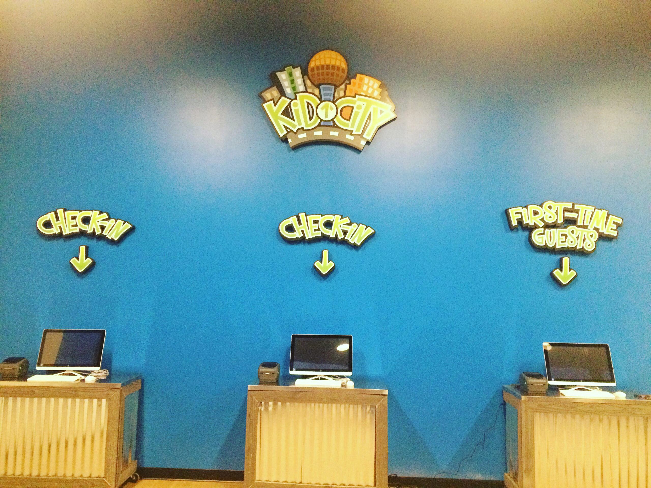
▲ illustrated logo design
Created with “comic book” style city skyline and logo design. Logo was also printed on matt laminated foam core and placed above main entrance to “Kid City”.
► set design
Set signage is printed on laminated foam core and wall decal materials. Final PDFs for each classroom door are available on the central file system for locations to print. Fabric for door awnings were chosen during the set design and sewn by church staff.

layout
set signage

illustration
computer graphics

elevation drafting
measurements

video design
projection screen

branding
logo design
